Thursday, 24 February 2011

Brit Insurance Designs Of The Year 2011


I went to the Design Museum to see the nominations for the Brit Insurance Designs Awards,  which is "the Oscars of the design world" showcasing the most innovative and forward thinking designs from around the world.   My personal favourite was probably the smallest and most less obvious piece, Hye-Yeon Park's In Between Clock.  As seen below it shows the transformation between each number so as like a non digital clock you can actually see the passing of time.


As a fan of Johnny Cash i also really liked The Johnny Cash Project by Chris Milk (below).  I really recommend going to see the show, its so vast, showing designs from seven categories: architecture, fashion, furniture, graphics, interactive, product and transport.

http://www.youtube.com/watch?v=PBmky9Tx2UM

Tate Britain - Susan Hiller


On Tuesday I went to the Tate Britain to see the Susan Hiller exhibition.  It wasn't quite what i pictured but a lot of the pieces were very interesting and i could of spent a long time in there looking around all of the different installations.  Hiller juxtaposes knowledge derived from anthropology, psychoanalysis and other scientific disciplines with materials generally considered unimportant.  She combines the familiar and the unexplained and encourages the viewer to participate in the creation of meaning.  The picture above is of PSI Girls, a film featuring imagery from films of girls with telekinetic powers with a soundtrack that reaches a crescendo at the point of the girls moving objects with their minds.  There were five film clips being shown, three i didn't know the name of but the other two where Matilda and The Craft.  Visually it was very appealing but it did hurt the visual and audio senses after a while! 

Contextual Studies Part 2

FILM REVIEW ON UNE FEMME EST UNE FEMME


Jean-Luc Godard’s 1960‘s neo-realist romantic comedic musical ‘Une Femme Est Une Femme (A Woman is a Woman) was one of my favorites of the films shown during the contextual studies film program.  Emma Simmonds (http://www.littlewhitelies.co.uk/
blog/cult-film-club-–-une-femme-est-une-femme-13799) described it as being “both as stylish and non conformist as you’d expect” from Godard.  What I thought made this improvisational picture so compelling was its simplistic plot line paralleled with its unusual editing and the use of expressive music throughout to punctuate dialogue and often disrespectfully to undermine the seriousness of sequences.  Left Field Cinema describes the use of music as bringing “energy and life to a pointless love triangle”, although I agree that it does bring energy and life I disagree that it is a pointless love triangle, peculiar yes but not pointless.
Parallels can be drawn between Jean-Luc Godard’s Une Femme Est Une Femme and Blake Edwards’ Breakfast at Tiffany’s.  Both pictures were created in 1961 and even though one is set in Paris, France while the other is in New York, America they have a similar feel about them, for example the characters and their costumes and makeup.

Both leading ladies are beautiful brunettes in an ira when it was all about blondes for instance Lana Turner and Marilyn Monroe.  They added something different to the films they appeared in and helped to create the impression of ‘the modern woman’ through characters who were individual and spirited women.  The characters of Angela and Holly Golightly are both women who obtain money from men; Holly is basically a call girl and Angela is a stripper,  however in the film not much is seen of this side of her as the central theme is love and relationships.  The focus of the narratives in both about the woman’s want of something, in ‘breakfast at tiffany’s’ Holly is after money and the the chance to get into the ‘big leagues’ and in ‘a women is a women’ Angela is in desperate need of a baby a better life.  When writing about the central character Christopher Null says “you can't help but love the fluttering eyelids of Karina and her earnest desire for a better life.”(http://www.filmcritic.com/reviews/1961/a-woman-is-a-woman/)
One of the most interesting aspects of A Woman is a Women is its documentation of the sheer otherness of all women, this concept is reflected in art especially since the late 1960s, when the feminist art movement can be said to have emerged.  Artist such as Barbara Kruger have been particularly interested in what makes females different from males.  When talking about her work she said “I think I developed language skills to deal with threat. It's the girl thing to do-you know, instead of pulling out a gun."

In conclusion this film is a rather hopeful movie, for a movement that rejects classical cinematic forms (New Wave) and what appealed to me is the blurred line between everyday life and cinematic entertainment that it held, with an undertow of feminism and the power of women:  “Tu est infame! Sweetly she corrects him: “Non, je suis une femme” A woman’s gotta do what a woman’s gotta do. 

Monday, 14 February 2011

Does it Matter?

Sophie picked this fact for me:
"The Average Child Asks 400 Questions A Day"


At first i was a bit worried, i had no idea where to start, and as i don't know any children in London i thought the only way i was going to do any research was by stranger observation so i caught a bus from Chelsea to Borough and luckily there were school children on it.  however i quickly realised that these were not the type of children you wanted asking you 400 questions a day so i decided that i wouldn't continue further down that route instead i decided not to focus so much on actual words but the concept.

My aim was to convey people involved, time period, quantity and stress and strain in a week project.  I focused first on the people involved which would be assumably parents and child and things that would represent them.  This is my basic idea:


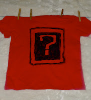
I chose a laundry line because its a way of conveying time and its usually the parents who deals with it, but it also shown mass quantity.  I printed question words on each sock to show range and that each one represented a question.

Fridays crit was very helpful, people offered really good advise for example to change the question mark sign as it looks like a symbol for a Black Eyes Peas song,  someone else recommended not having so much red.  and Wendy also gave some helpful pointers on how to progress it,  however i haven't been able to do very much on it since then,  but i did decide on a new question mark and to vary the colours between the prime colours and green.  Hopefully i should have time as its got along way to go but a lot of potential.

Just So...You Know

When we were given our brief i thought what are the chances; as earlier in the term i had got out a book on typography from the library to help with one of my projects and although i didn't find the book very helpful  to that current project i did learn something i thought was quite interest which was that the letter A originally started upside down as a pictogram illustrating the head and horns of an ox (V).  this projects brief started with this same fact, i assumed it was a good sign!!

MOSQUITO

We where all given an animal and told to do research on it, and find interesting fact about it.  The three that struck me were that 1.  Only female mosquitos need blood, which is for making eggs.  2.  Mosquitos are attracted to something in different peoples sweat.  3.  Some scientist believe that wiping out mosquitos completely wouldn't hurt the ecosystem.  So i decided to focus my research within these areas.

Firstly i started by focusing on blood  here are some of my initial ideas:  I wanted to show obviously that blood is a food source to female mosquitos, hence the straw in the test tubes.  i then got onto the idea of humans being basically blood donors to mosquitos, and how people would feel if the blood they donated was used in this way.  i tried to demonstrate this by adding the blood types to the tubes, to make it appear as if mosquitoes had a preference.  With the "save a life, give blood" posters i felt the slogan worked well with the concept of Mosquitoes as the blood is used to create new life.


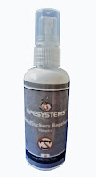
From the poster above i found it lent towards the idea of Vampires and their similarities to mosquitoes as both blood drinking creatures.  I then modified Lifesystems brand of mosquito repellent to apply to vampires instead.


For my final piece i kept with this theme of vampires and mosquitos, and as vampires are very 'in' at the moment i had a lot of material to work with.  There are several very iconic images at this time for example the Twilight book cover is very recognisable.  I selected  a range of vampire themed books all with very different graphics whether focusing on horror, lust or with a more teen angle.  One of the books i selected wasn't about vampires but i loved the cover art and it was based on 'killer' wasps,  which i felt was still in keeping.   With each book cover i modified it to be focused on mosquitos,  in some cases it was done more subtly than other.  My intention was to kind of deceive a viewer,  so at first glance them would mistake it for the original.   (In August 2006 Banksy did a similar thing by replacing 500 Paris Hilton CDs with reworked versions and doctored pictures with slogan like "90% of success is just showing up" on them.  He restocked 42 stores in the UK, I couldn't imagine pulling something like that of!)     
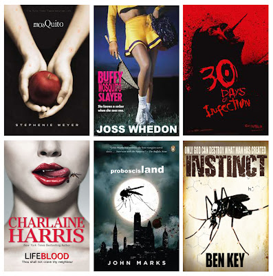

For some of the images i only changed small things and changed the titles using the same fonts.  With twilight i added mosquito bites to the arms and hands holding the apple and changed the title.  some were more obvious for example the last two,  they both have quite big images of mosquitos!   

Friday, 11 February 2011

The Chelsea Font!

For this project I paired up with Sophie Farrar and we where given the task of creating a letter press that prints our letter (N) in the most clear, clean and creative way possible, made out of any material.  After we were given the brief we collected a wide range of materials and objects from out halls skip, these things included: old light fixtures, bike chains, a broken bin, wires, a pair of leather boots, and a lot of nuts and bolts, among other things.  this was our creative process:


What I liked about this project was that it was all about experimentation and we had no idea how it was going to turn out.  I also got to see a lot more of Chelsea for example the workshop rooms (when we went looking for extra nuts and bolts)

Our final design which we won best looking machine for !!! :


Our printed letter.

Extraordinary Books

We were given a list of 30 possible concepts for books,  from this list I managed to cut it down to 13 ideas which i could work with.  I definitely think this was one of the best briefs I have been set so far, as the are no boundaries and countless opportunities for creativeness.  The three I narrowed it down to where:  

A Concealing Book

As a child i always loved in movies when a character had something secrete hidden in a book.  So i decided to create a book that concealed something on the inside but on the outside looked like an ordinary hard back book.  Firstly I cut out almost all the middles of the pages of a book to create the place to conceal the object.  I left the first few pages complete in order to create a greater illusion of a normal book.  To finnish it of I cowered the hiding place in an army acrylic print.
A Floating Book

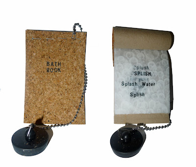
There is always the dilemma of 'should I read in the bath?' Because if it is dropped it will get soaked and be ruined.  so I decided to make a book made out of cork as it is a material that floats.  I added a plug and chain to create a more bath time feel,  it would also be quite useful as long as the chain was long enough! 

A Temporary Book

When I saw this title it automatically conjured up images of ancient volumes which have to be handled while wearing gloves to protect their delicate pages.  I created this book which has to be handled using tweezers as the paper can disperse when wet which would ruin it.  I attached a pair of tweezers to the cover using a fine black thread.


I like the idea of books having a purpose and/or solves a problem.  Also the idea of as well as being able to be read they have a function.


We then had to develop and duplicate one of our ideas.  I decided on the 'Floating Book' as it had the most potential for development.  I made the book entirely water proof. Even the pages were waterproof as I printed the text onto semitransparent shower curtain.  The text was a short poem designed for children about bath time.  I also switched the handmade chain for a more realistic bath chain.

I See What You Mean - Part 2

To develop our typography further we were given the challenge of taking our work off the layout pad and out into the environment.

For the text "what you have is a blundering mind", I focused on the idea of the use of the brain.  As my typographical connotation of this included a jumble of words which looks like an extract from a newspaper I thought the rational development for putting my text in its likely environment would be to introduce it to a newspaper/news and current affairs magazine.  I chose Private Eye for its simplistic front cover and the framing which would accentuate my image.


For my next idea I decided to be more experimental and creative.


I still focused on the brain and came up with the concept of a CT Scan film.  Placing the film behind my typography with the film showing through the letters I created a satisfying outcome.  To create a more realistic impression I created the illusion of a light board by printing the image on acetate and sticking it to a mirror and photographing it with a strong flash; therefore the mirror acted the same way as a light board and reflected light through clear places.  

For the second line of text "what you are is a blundering heart", again I started with a fairly basic concept,  focusing on the most visual aspect of the text the "heart". 


I minimised the text and printed it onto a red t-shirt using sticky back plastic and black acrylic.  I placed the 'logo' over the left breast so that it is positioned over the heart.     


For my second idea I created a life size (as far as i could estimate) replica of a human heart out of clay and mesh.  I then transferred my typography onto the heart, fitting to the contours.  I decided to place the heart (with an excess of blood and the final word from the extract) onto newspaper to visualise the idea of learning.