Thursday, 31 March 2011

Evaluation

I have found The FMP quite different from all the previous projects we have been set during Foundation, I believe this is due mainly to its six week span.  Due to this I was able to conduct more extensive research into my area than in previous projects.  This was beneficial as I was able to truly comprehend the subject, including its context, as well as manipulate it more effectively for the development of my project.  My research began with reading a number of books, watching documentaries, films and visited galleries to absorb as much varied information as possible and help generate ideas.  Sources such as The Brothers Grimm were crucial to my primary research and lead me to areas I had not anticipated in my bibliography.   It turns out that my most invaluable research was the questionnaire I conducted in the projects first week.  The answers I received from the public gave me new inspiration and pushed forward my material exploration. I didn’t anticipate the amount of influence it would have on my work in general or my final piece.  
My action plan consisted of three main stages: research, material and concept experimentation, and project realisation.  I feel I stuck to these guidelines effectively and for this reason my plan was very beneficial.  However I realised that like life a project is unpredictable.  After failing to create my first practical piece of work due to actors schedule conflicts, I was forced to experiment with my filming and not work from a plan.  I stepped outside my comfort zone and undertake an unplanned project that was unexpected and more natural which turned out to be the most important step in my development and the bases for a lot of my later work.
Towards the final weeks of the project, I started to experiment more with photography, typography and illustration as although the techniques I was using, mainly film, were effective communicators I thought I needed to widen my basis to truly progress. However I reverted back to film in the end. 
My reflective journal has been key in my development of this project, by documenting my processes online I was able to organize my thoughts, ideas and feedback in a way that I could reflect back on, while saving time, as the computer took care of my issue with being a perfectionist.  It was also where I recorded feedback from tutors and fellow student, helping me progress my project past primary and research stages and lead me down unexpected paths.  
In my proposal I wrote that my aim was to “communicate creatively and visually personal fears; as well as the origins, manifestations and overcoming of said fears”. When I wrote this I never thought it would be possible to combine all of the influences, areas and my thoughts into one final piece.  However through a combination of my research questionnaire and process exploration I was able to achieve this.  Due to The Final Major Project I now feel more confident when set a brief as I have more knowledge of the project processes as a whole due to having to write my own, and I hope to take away with me everything I have learned throughout this project.

Wednesday, 30 March 2011

A Short Film About Fears, Phobias and Nightmares


This is my final piece for my Final Major Project,  as you can see i added in the questions between the different films.  Combining the films was harder than i had thought as i could only move the footage over and not the music so i had to redo all the music and sound effects which took a lot longer than i thought it would and was annoying because i had already done it.  But i really like the overall effect of the film and considering all the hard work that went into it i can't believe it is only 6 minutes, you could think of it this way a minute a week!!

Irrational Fears

For my final piece i decided to combine the movies i had made before but as i had only made four i needed to make one more.  I realised when faced with this that i had already done two nightmare films and two fear films and that if i made my last film about phobias like my questionnaire they would be to similar and not cover the subject as broadly so i decided to rewrite the question to be about irrational fears.  After talking to a few people, mainly girls, i discovered that since moving to london they have become paranoid about being followed/mugged.  So i made a short film on this idea.

Nightmare Book

I wanted to use the artist book i had made in the workshop in my FMP and as i hadn't represented many of the answers to my questionnaire only the ones through film, i decided it would be a perfect medium to do so.  I started by focusing on the answers to the nightmare questions and picking those that had the most potential for a illustration.  I surmised an order based on how the images would look next to each other and to create a progression i gave each page a letter and as whole the letters spelled out Nightmare State.


I really like the way that the book turned out, especially as all the pictures are very similar in style and with the descriptions of said persons nightmare bellow i think a zig zag book was the perfect way to go.


Spider

To continue my phobia project i made a life size model of a tarantula using wire, mesh, moulding clay, acrylic and steel wool.  In order to communicate the idea that it creates fear in me i played around with typography and came up with this.  To make the web i used a glue gun which once dried i was able to peel off and move around.  I really liked the idea of using typography mixed with demonstrative photography that i continued with it and did the same for several other fears that people had written in my questionnaire.


I focused on fears that i would be able to represent visually, which were Fear of the dark, fear of drowning, fear of heights fear of blood, fear of doctors, claustrophobia and fear of death.


Above is the final photographs for fear of doctors, which is tablets with the word fear printed on them in a prescription bottle,  i really like the effect the bottle had on the light in this photo and the reflections created.  The other photo is for fear of the dark, originally i wanted to have the words fear shown as a shadow but it was almost imposable for me to photograph so instead i created this. 

This is one of the image i made to represent a fear of heights,  what i like most about it is the positioning of the hand in relation the the staircase and the way the viewers eye is directed to the centre of the staircase which looks never ending amplifying the appearance of height.  The other heights image i created consisted of the word fear written in bird poo, actually acrylic and glue, and placed on my windowsill, i photographed it with a view of below to give the intended appearance of  height.  

Monday, 21 March 2011

Making Books


We learned how to make Artist Books in a workshop,  this is my homemade book.  I don't know if i will use it in my FMP but anyway its a useful skill to know which i will most definitely use at some point.

Phobias

From my questionnaire i found that the majority of people who had a phobias it was of spiders, however people also had fears of snakes, the dark, drowning, rats, clowns and fish skin!   My personal phobia is Arachnophobia, the fear of spiders, i cant even look at them without shivering.  So i tried a combination of flooding and systematic desensitisation techniques to try and concur my fear.  My drawing below was the second part to my desensitisation therapy, drawing a spider.  The first was looking at photos!  


I then went to The Tropical Museum in Syon Park in London to see a real live Tarantula.  This was where i went onto the flooding technique of getting over my fear,  before i went i had decided that i was going to hold a tarantula and document it through film.  I almost backed out at the last minute, in fact i did but then my friend convinced me.  The particular spider i held was a Chilean Rose Tarantula or specifically a Grammostola Rosea. 

This video is still a work in progress!


Nightmares


I thought this answer by Sean was very interesting and different from the usual answers to this question about nightmares.   It was simple yet i imagined quite visually effective.  So i went about trying to create it through film.


Nightmares

Another common theme with answers to my questionnaire is falling:

"Yes, falling off a cliff. Free falling then waking up" RALPH
"the ground opened and i fell down" REBECCA
"I keep falling from tall buildings and didn't stop. Like falling into a black hole" KATIE

I decided to create a short video based on the concept of falling.  My source was footage i have of when i went sky diving in Australia.  As i wanted to make the film more general i used manly clips of downward shots and parachute shots so it could be anyone falling.  I decided to add a small clip of myself, for one thing to make the video a bit longer and make it a bit personal.
  

                    http://www.youtube.com/watch?v=phlSVg0Cf0A


This is an example of a fear of heights as nightmares stem from what we fear.

The concept of falling nightmares ties in with another possible direction my research could head, adrenaline junkies.  Adrenaline junkies are people who seek out a natural high from physical thrills for example mountain climbing, white water rafting, bungee jumping, paragliding and skydiving.  127 hours is a film based on a true story about a mountain climber who had to resort on amputating his own arm after becoming trapped by a bolder during canyoning in Utah.

Nightmares

From the research questionnaire i conducted i got a lot of interesting answers particularly to the questions about nightmares,  they were all very individual in the specifics however they all seemed to contain similar themes particularly at a younger age.  These included nightmares about dinosaurs, evil unicorns, aliens, space, dark woods, murderers and grim reapers, witches and family members dying.


I felt this particular answer had a lot of potential as a lot of people have nightmares about death of family members and i personally have always thought little girl ghosts were majorly creepy!


This is the first film i have made using moving images so it took along time for me to get down a rhythm, but i think the overall effect is very similar to how i intended it to appear.  I merged images of a 'child ghost' and 'witchcraft' with 'dark woods' in order to combine more than just the one answer, but give it the feel of childhood nightmares in general. 

Fairy Tales and Folklore

One of the places i started my research was within the area of fairytales and folklore, in particular the Brothers Grimm tales as they originate from folklore and are timeless and even though they were officially documented in the 1800's they are still in use today.  Another source i drew inspiration from was Bruno Bettelheim's book The Uses of Enchantment, the meaning and importance of fairytales.  Fairytales such as the Brothers Grimm are quite controversial, modern parents perceive them as to dark for children,  however it is documented in Bettelheim's book that they are beneficial to a child's development.


I visited Kensington Palace as they had put on an exhibition called the Enchanted Palace documenting the lives of the princesses who have lived there but put into the context of fairytales.  it was a very visually appealing display combining fashion, storytelling, sculpture, and video.  unfortunately you weren't able to take photographs in the palace!

I think fairytales are important as they tell the child about perceiving dangers thus they tie in with my brief as it is on this knowledge as a child that we first start to develop fears.  Most fairytales work as cautionary tales for example a child could take from snow white and little red cap the dangers of talking to strangers.

Guillermo del Toro's Pan's Labyrinth is an example of the use of fairy tales in a modern setting,  the film is described as being a fairytale for adults and personally i think it is quite a dark fantasy.  As an young adult i find it quite a disturbing film,  this could come from the fact that it conjures memories of when i was younger and similar fantastical fears i had or the creatures depicted in the film that are so creepy and are classic nightmare fiends.  del Toro said that the inspiration for the film came from a lucid dream he had as a child.  For this reason i think the film is so effective, by using personal experience rather that generic influences.

Final Major Project Proposal

This is my project proposal, I have decided on the title of Creative Visual Solutions to Facing Fears,  I feel this is only a working title and may change it at a later date to fit better with my project:

Progress and achievement
Foundation has really helped me to be able to have numerous ideas when given little information which has definitely boosted my confidence when faced with a brief.  I also have a much clearer understanding of design and its many aspects, and how to think in a more visual way compared to when I start the course.

Context
What first drew me to Visual communications was the wide range of work that could and was being produced and its individuality and cleverness.  When in this rotation I felt that my work showed more potential and personality than at other times and that what I was doing was challenging, stimulating and interesting.  Initially some of the set briefs I found very difficult but by overcoming these problems I grew in confidence and skill.  In general I was pleased with the outcomes however although I tried to access a wide range of aspects of this area I seemed to find a lot of my work had a typographical element to it,  so in the future i would want to focus on the full spectrum.

ProjectProposal Aims, Method and Realization
The aim of my project is to communicate creatively and visually personal fears; as well as the origin, manifestation and overcoming of said fears.  In order to achieve my brief I will research into the psychological side of fear,  how other artists have represented not only fear but other mental emotions and the origin of a persons fear.  I will conduct questionnaires for initial information and in order to personalise my research I will face my personal fear, arachnophobia, in a physical way and document it.  I will try to make a natural progression towards my final piece and focus strongly on the experimentation and development aspects of this project.  Throughout the development of the project I intend to experiment with many methods including film, in both a documentary and fictional way as well as photography,  while incorporating a typographical element.
Evaluation
I aim to follow my action plan time table as closely as possible therefor I will be able to judge my development and time management effectively. I will also be keeping a reflective journal as continual evaluation throughout this project which will document the decisions and the actions I have taken and feedback I have received from tutors and peers in a detailed way. 

Thursday, 24 February 2011

Brit Insurance Designs Of The Year 2011


I went to the Design Museum to see the nominations for the Brit Insurance Designs Awards,  which is "the Oscars of the design world" showcasing the most innovative and forward thinking designs from around the world.   My personal favourite was probably the smallest and most less obvious piece, Hye-Yeon Park's In Between Clock.  As seen below it shows the transformation between each number so as like a non digital clock you can actually see the passing of time.


As a fan of Johnny Cash i also really liked The Johnny Cash Project by Chris Milk (below).  I really recommend going to see the show, its so vast, showing designs from seven categories: architecture, fashion, furniture, graphics, interactive, product and transport.

http://www.youtube.com/watch?v=PBmky9Tx2UM

Tate Britain - Susan Hiller


On Tuesday I went to the Tate Britain to see the Susan Hiller exhibition.  It wasn't quite what i pictured but a lot of the pieces were very interesting and i could of spent a long time in there looking around all of the different installations.  Hiller juxtaposes knowledge derived from anthropology, psychoanalysis and other scientific disciplines with materials generally considered unimportant.  She combines the familiar and the unexplained and encourages the viewer to participate in the creation of meaning.  The picture above is of PSI Girls, a film featuring imagery from films of girls with telekinetic powers with a soundtrack that reaches a crescendo at the point of the girls moving objects with their minds.  There were five film clips being shown, three i didn't know the name of but the other two where Matilda and The Craft.  Visually it was very appealing but it did hurt the visual and audio senses after a while! 

Contextual Studies Part 2

FILM REVIEW ON UNE FEMME EST UNE FEMME


Jean-Luc Godard’s 1960‘s neo-realist romantic comedic musical ‘Une Femme Est Une Femme (A Woman is a Woman) was one of my favorites of the films shown during the contextual studies film program.  Emma Simmonds (http://www.littlewhitelies.co.uk/
blog/cult-film-club-–-une-femme-est-une-femme-13799) described it as being “both as stylish and non conformist as you’d expect” from Godard.  What I thought made this improvisational picture so compelling was its simplistic plot line paralleled with its unusual editing and the use of expressive music throughout to punctuate dialogue and often disrespectfully to undermine the seriousness of sequences.  Left Field Cinema describes the use of music as bringing “energy and life to a pointless love triangle”, although I agree that it does bring energy and life I disagree that it is a pointless love triangle, peculiar yes but not pointless.
Parallels can be drawn between Jean-Luc Godard’s Une Femme Est Une Femme and Blake Edwards’ Breakfast at Tiffany’s.  Both pictures were created in 1961 and even though one is set in Paris, France while the other is in New York, America they have a similar feel about them, for example the characters and their costumes and makeup.

Both leading ladies are beautiful brunettes in an ira when it was all about blondes for instance Lana Turner and Marilyn Monroe.  They added something different to the films they appeared in and helped to create the impression of ‘the modern woman’ through characters who were individual and spirited women.  The characters of Angela and Holly Golightly are both women who obtain money from men; Holly is basically a call girl and Angela is a stripper,  however in the film not much is seen of this side of her as the central theme is love and relationships.  The focus of the narratives in both about the woman’s want of something, in ‘breakfast at tiffany’s’ Holly is after money and the the chance to get into the ‘big leagues’ and in ‘a women is a women’ Angela is in desperate need of a baby a better life.  When writing about the central character Christopher Null says “you can't help but love the fluttering eyelids of Karina and her earnest desire for a better life.”(http://www.filmcritic.com/reviews/1961/a-woman-is-a-woman/)
One of the most interesting aspects of A Woman is a Women is its documentation of the sheer otherness of all women, this concept is reflected in art especially since the late 1960s, when the feminist art movement can be said to have emerged.  Artist such as Barbara Kruger have been particularly interested in what makes females different from males.  When talking about her work she said “I think I developed language skills to deal with threat. It's the girl thing to do-you know, instead of pulling out a gun."

In conclusion this film is a rather hopeful movie, for a movement that rejects classical cinematic forms (New Wave) and what appealed to me is the blurred line between everyday life and cinematic entertainment that it held, with an undertow of feminism and the power of women:  “Tu est infame! Sweetly she corrects him: “Non, je suis une femme” A woman’s gotta do what a woman’s gotta do. 

Monday, 14 February 2011

Does it Matter?

Sophie picked this fact for me:
"The Average Child Asks 400 Questions A Day"


At first i was a bit worried, i had no idea where to start, and as i don't know any children in London i thought the only way i was going to do any research was by stranger observation so i caught a bus from Chelsea to Borough and luckily there were school children on it.  however i quickly realised that these were not the type of children you wanted asking you 400 questions a day so i decided that i wouldn't continue further down that route instead i decided not to focus so much on actual words but the concept.

My aim was to convey people involved, time period, quantity and stress and strain in a week project.  I focused first on the people involved which would be assumably parents and child and things that would represent them.  This is my basic idea:


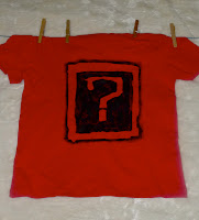
I chose a laundry line because its a way of conveying time and its usually the parents who deals with it, but it also shown mass quantity.  I printed question words on each sock to show range and that each one represented a question.

Fridays crit was very helpful, people offered really good advise for example to change the question mark sign as it looks like a symbol for a Black Eyes Peas song,  someone else recommended not having so much red.  and Wendy also gave some helpful pointers on how to progress it,  however i haven't been able to do very much on it since then,  but i did decide on a new question mark and to vary the colours between the prime colours and green.  Hopefully i should have time as its got along way to go but a lot of potential.

Just So...You Know

When we were given our brief i thought what are the chances; as earlier in the term i had got out a book on typography from the library to help with one of my projects and although i didn't find the book very helpful  to that current project i did learn something i thought was quite interest which was that the letter A originally started upside down as a pictogram illustrating the head and horns of an ox (V).  this projects brief started with this same fact, i assumed it was a good sign!!

MOSQUITO

We where all given an animal and told to do research on it, and find interesting fact about it.  The three that struck me were that 1.  Only female mosquitos need blood, which is for making eggs.  2.  Mosquitos are attracted to something in different peoples sweat.  3.  Some scientist believe that wiping out mosquitos completely wouldn't hurt the ecosystem.  So i decided to focus my research within these areas.

Firstly i started by focusing on blood  here are some of my initial ideas:  I wanted to show obviously that blood is a food source to female mosquitos, hence the straw in the test tubes.  i then got onto the idea of humans being basically blood donors to mosquitos, and how people would feel if the blood they donated was used in this way.  i tried to demonstrate this by adding the blood types to the tubes, to make it appear as if mosquitoes had a preference.  With the "save a life, give blood" posters i felt the slogan worked well with the concept of Mosquitoes as the blood is used to create new life.


From the poster above i found it lent towards the idea of Vampires and their similarities to mosquitoes as both blood drinking creatures.  I then modified Lifesystems brand of mosquito repellent to apply to vampires instead.


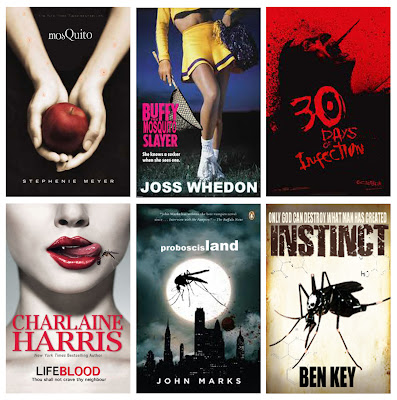
For my final piece i kept with this theme of vampires and mosquitos, and as vampires are very 'in' at the moment i had a lot of material to work with.  There are several very iconic images at this time for example the Twilight book cover is very recognisable.  I selected  a range of vampire themed books all with very different graphics whether focusing on horror, lust or with a more teen angle.  One of the books i selected wasn't about vampires but i loved the cover art and it was based on 'killer' wasps,  which i felt was still in keeping.   With each book cover i modified it to be focused on mosquitos,  in some cases it was done more subtly than other.  My intention was to kind of deceive a viewer,  so at first glance them would mistake it for the original.   (In August 2006 Banksy did a similar thing by replacing 500 Paris Hilton CDs with reworked versions and doctored pictures with slogan like "90% of success is just showing up" on them.  He restocked 42 stores in the UK, I couldn't imagine pulling something like that of!)     


For some of the images i only changed small things and changed the titles using the same fonts.  With twilight i added mosquito bites to the arms and hands holding the apple and changed the title.  some were more obvious for example the last two,  they both have quite big images of mosquitos!   

Friday, 11 February 2011

The Chelsea Font!

For this project I paired up with Sophie Farrar and we where given the task of creating a letter press that prints our letter (N) in the most clear, clean and creative way possible, made out of any material.  After we were given the brief we collected a wide range of materials and objects from out halls skip, these things included: old light fixtures, bike chains, a broken bin, wires, a pair of leather boots, and a lot of nuts and bolts, among other things.  this was our creative process:


What I liked about this project was that it was all about experimentation and we had no idea how it was going to turn out.  I also got to see a lot more of Chelsea for example the workshop rooms (when we went looking for extra nuts and bolts)

Our final design which we won best looking machine for !!! :


Our printed letter.

Extraordinary Books

We were given a list of 30 possible concepts for books,  from this list I managed to cut it down to 13 ideas which i could work with.  I definitely think this was one of the best briefs I have been set so far, as the are no boundaries and countless opportunities for creativeness.  The three I narrowed it down to where:  

A Concealing Book

As a child i always loved in movies when a character had something secrete hidden in a book.  So i decided to create a book that concealed something on the inside but on the outside looked like an ordinary hard back book.  Firstly I cut out almost all the middles of the pages of a book to create the place to conceal the object.  I left the first few pages complete in order to create a greater illusion of a normal book.  To finnish it of I cowered the hiding place in an army acrylic print.
A Floating Book

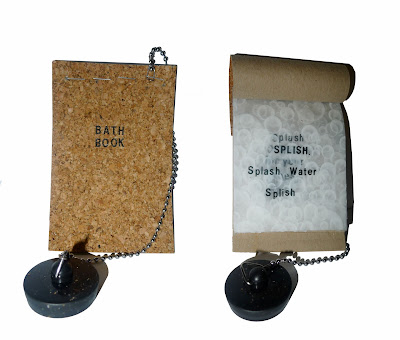
There is always the dilemma of 'should I read in the bath?' Because if it is dropped it will get soaked and be ruined.  so I decided to make a book made out of cork as it is a material that floats.  I added a plug and chain to create a more bath time feel,  it would also be quite useful as long as the chain was long enough! 

A Temporary Book

When I saw this title it automatically conjured up images of ancient volumes which have to be handled while wearing gloves to protect their delicate pages.  I created this book which has to be handled using tweezers as the paper can disperse when wet which would ruin it.  I attached a pair of tweezers to the cover using a fine black thread.


I like the idea of books having a purpose and/or solves a problem.  Also the idea of as well as being able to be read they have a function.


We then had to develop and duplicate one of our ideas.  I decided on the 'Floating Book' as it had the most potential for development.  I made the book entirely water proof. Even the pages were waterproof as I printed the text onto semitransparent shower curtain.  The text was a short poem designed for children about bath time.  I also switched the handmade chain for a more realistic bath chain.

I See What You Mean - Part 2

To develop our typography further we were given the challenge of taking our work off the layout pad and out into the environment.

For the text "what you have is a blundering mind", I focused on the idea of the use of the brain.  As my typographical connotation of this included a jumble of words which looks like an extract from a newspaper I thought the rational development for putting my text in its likely environment would be to introduce it to a newspaper/news and current affairs magazine.  I chose Private Eye for its simplistic front cover and the framing which would accentuate my image.


For my next idea I decided to be more experimental and creative.


I still focused on the brain and came up with the concept of a CT Scan film.  Placing the film behind my typography with the film showing through the letters I created a satisfying outcome.  To create a more realistic impression I created the illusion of a light board by printing the image on acetate and sticking it to a mirror and photographing it with a strong flash; therefore the mirror acted the same way as a light board and reflected light through clear places.  

For the second line of text "what you are is a blundering heart", again I started with a fairly basic concept,  focusing on the most visual aspect of the text the "heart". 


I minimised the text and printed it onto a red t-shirt using sticky back plastic and black acrylic.  I placed the 'logo' over the left breast so that it is positioned over the heart.     


For my second idea I created a life size (as far as i could estimate) replica of a human heart out of clay and mesh.  I then transferred my typography onto the heart, fitting to the contours.  I decided to place the heart (with an excess of blood and the final word from the extract) onto newspaper to visualise the idea of learning.